Perfectly Fitting Text to Container in React
The Problem Space
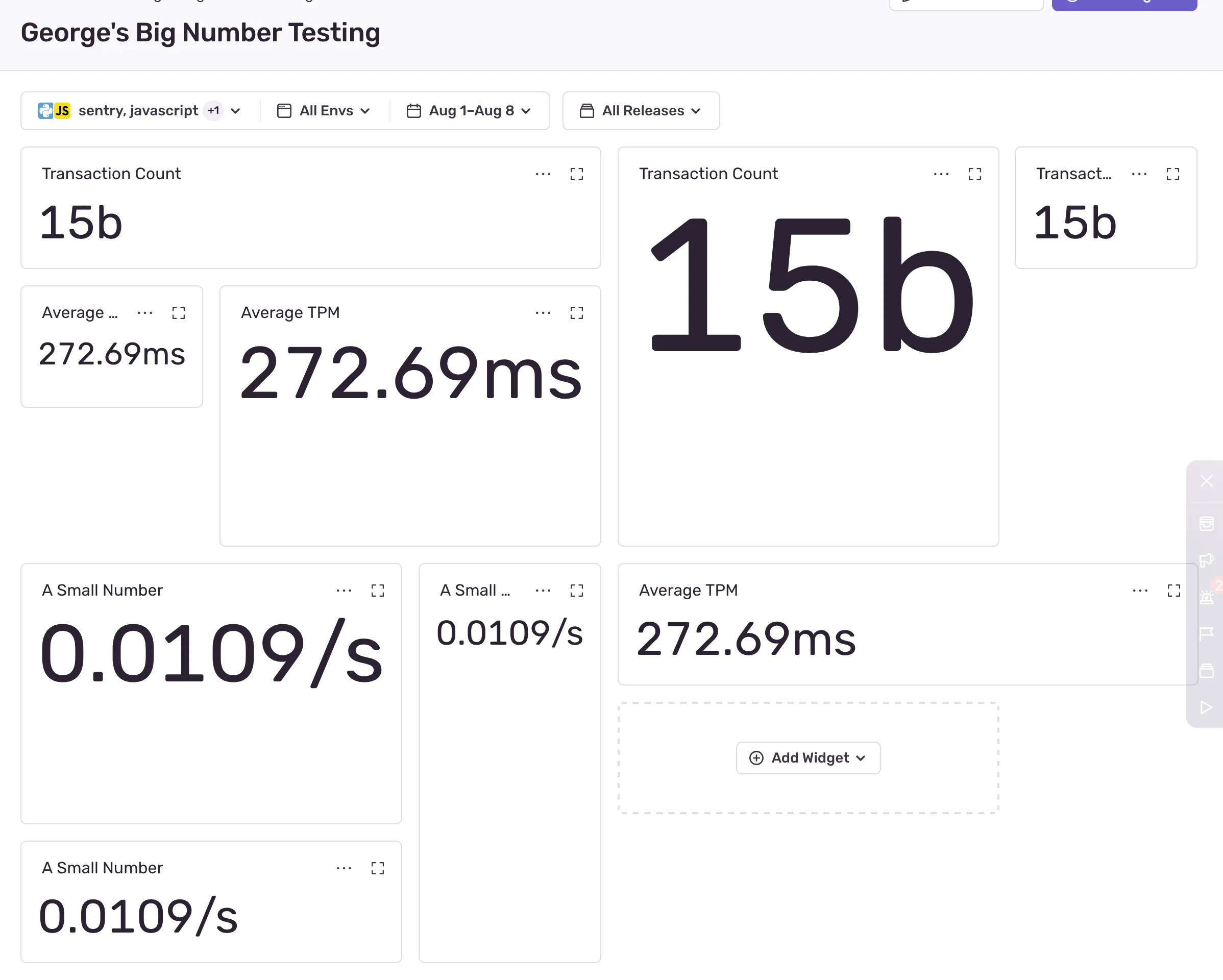
In Sentry, a dashboard is a customizable page where users can add charts, tables, and other widgets to visualize their telemetry data. One of the widget types is the aptly-named “Big Number”. This is useful for showing single metrics like counts of issues, average response times, etc. The “Big” of “Big Number” is hiding a lot of complexity, because, well, how big are we talkin’?
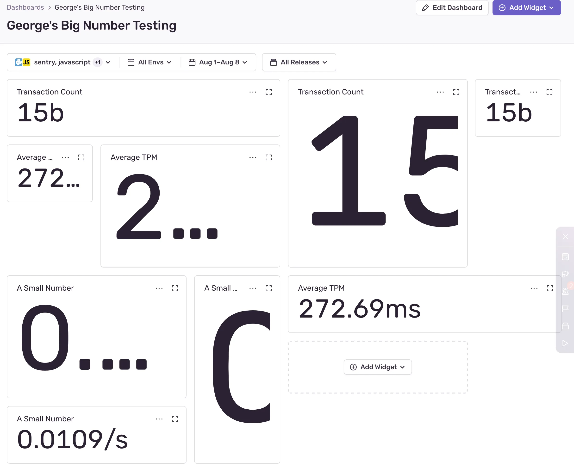
It’s easy to get “big” wrong. The ideal “big” is as big as possible but never too big. That’s the whole problem space. The solution space to this problem (like many UI problems) ended up more complicated than I expected. I chipped away at it with help from Jonas (resident expert of unusual React rendering strategies) for a while, and here I’m documenting the lessons learned.
The Solution Space
There are a few aspects to the solution that I consider “requirements”:
- Definitely: The numbers in the widgets are nearly perfectly sized. I’d be open to a mismatch in the 1-2% range, but not more
- Definitely: The numbers never overflow the widgets. No scrollbars or cut-off numbers
- Definitely: The sizing algorithm does not meaningfully contribute to perceptible page load time (let’s say faster than 100ms)
- Hopefully: The number text looks great (subjective but I know it when I don’t see it)
- Hopefully: The numbers in the widgets are selectable, announceable by A11y tools, etc.
As far as I could figure out, there are 4 and a half viable approaches.
Approach 1: SVGs
Scalable Vector Graphics or SVGs literally start with “scalable”, which seems like a great potential solution. I figured a combination of viewBox trickery and with object-fit: contain; would do the trick, since <svg> supports a <text> element. <text> elements are selectable, and hopefully a screen reader can announce them? This appeals, but linearly scaling text and choosing the correct font size aren’t the same.
Rubik’s type tester page on Google Fonts illustrates the point. Try changing the font size and you’ll see how the font subtly changes characteristics. Type designers are very careful about this, especially at small sizes where legibility is a problem. Scaling an SVG does not do this, so the fonts would not look right at any size except the natural size.
Aside: There’s a tricky related effect where the larger a number is, the tighter the tracking has to be, but we’ll pretend this isn’t a problem for now.
SVGs are a no-go. These will not look great, and “Pixels Matter” is one of literally only 6 values at Sentry.
Approach 2: CSS Transforms
A second possibility is using CSS transforms. transform: scale(??) can scale the text! This would be more complicated because we’d have to calculate the size in JavaScript and then apply it in CSS (yucky), but it also suffers from the same font scaling problem as SVGs. This is also a no-go.
Approach 3: Container Queries
CSS container queries are pretty widely supported now, and the premise seems helpful: scale the font size according to the container. This doesn’t work either because font size controls the height of the font. Scaling the font height with respect to the container Y axis height is easy, but we need to constrain the size based on both axes. Plus, we don’t know the contents. Plus even if we knew the contents (we kind of do), we don’t know the exact width of the characters inside!
Approach 4: JavaScript
There is prior art for this. jQuery plugins like textFix solve this problem by iteratively updating the font size of the element until it fits perfectly. The downside is, you’re using JavaScript, in a loop, to measure and set font size. Performance-conscious developers hate this. The upside is, you’re using regular DOM text elements! The scaling will be correct (modern browsers support sub-pixel scaling just fine), the text is selectable, announce-able, the whole deal. Spoiler: this is what we went with.
Bonus Half Approch: canvas
There’s a way (I hear) to render text to a canvas and use measureText to get the dimensions, but I don’t have a lot of canvas experience, handling device pixel ratios is apparently tricky, etc. The upside is avoiding layout thrashing by re-using a single <canvas> element. I’m keeping this in my back pocket if other approaches fail.
Attempt 1: Driving UI Through React State
The first version of the component stored everything in React state and drove UI updates through state updates. Here’s a pseudocode version:
function AutoSizedText({ children, minFontSize, maxFontSize, calculationCountLimit }: Props) {
  // Set up state variables for:
  // 1. Parent element height and width
  // 2. The current font size
  // 3. The most recent font size bounds
  // 4. Calculation count

  // Set up refs for:
  // 1. Wrapper of `ParentElement`
  // 2. Wrapper of `ChildElement`

  useResizeObserver({
    ref: parentRef,
    onResize: () => {
      // Reset the font size and its bounds
      // Store the parent width and height in React state
    };
  })

  useLayoutEffect(() => {
    // Get parent and children dimensions
    // Check the difference in parent and child dimensions
    // Run the resizing algorithm
  })

  return (
    <ParentElement>
      <ChildElement>
        {children}
      </ChildElement>
    </ParentElement>
  )
}- Almost everything is driven via React state. When
useResizeObserverruns, it updates the state. The state update triggers a re-render. The re-render triggersuseLayoutEffect. The layout effect updates the size.useResizeObserverruns - Only HTML elements are in
refs - The
useLayoutEffecthook has a dependency on literally every piece of React state, so it runs on pretty much every render - Each iteration of the resize algorithm updates the state, which triggers another run of the algorithm (more on the algorithm later)
- The component uses its a
ParentElementto wrap the child, for additional control
This, in my opinion, is a natural approach. It uses basic React primitives, generously assigns state, and uses the natural render lifecycle. The only interesting thing, in my opinion, is the use of useLayoutEffect over useEffect. useLayoutEffect blocks browser paint. More on this later, too.
Aside: React 18 very effectively batches setState calls so it’s not a problem to have a lot of state.
The problem is that using a combination of useEffect (the state it references is from the closure its in) and useRef (the state it references is always the most recent) caused me some grief, so I had to tinker with the code execution order. As often, I referenced Dan Abramov’s “A Complete Guide to useEffect” which is my favourite resource on the topic. The trick was storing the parent element dimensions in useState so that every render has a correct reference to the most recent known parent dimensions and the most recent known font size and bounds.
The result was pretty solid!
Aside: While I was figuring out my ref vs. state issues I started feeling the temptation to remove items from the useLayoutEffect dependency array, and had to remember that it’s almost universally a bad idea to lie to React about hook dependencies.
Detour: ref Callback Functions
Another interesting tidbit is that React supports ref callback functions even in recent versions! A ref callback can be an effective way to manage React refs, and in some cases can eliminate code. e.g.,
function MyComponent() {
  return <div ref={(node) => {
    if (node) {
      // The component just mounted. This might be a good time to run any just-mounted logic
    } else {
      // If node is `null`, the component just unmounted. This might be a good time to run any cleanup logic
    }
  }}>
}
I could have, in theory, put some of the mount/unmount logic in the ref callback, but I felt it was less clear than using a useLayoutEffect hook where the cleanup logic and re-calculation are clearly expressed.
The Resizing Algorithm
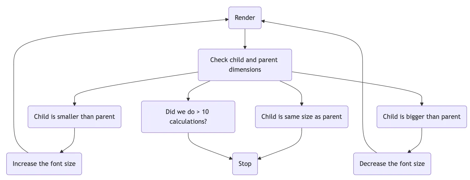
The crux is the algorithm. Let’s talk about how it chooses the font size. Here’s a flow diagram of what happens during render (on initial page load, or on resize):
Here’s a sample run of the calculation, and the React renders that result:
AutoSizedTextmounts. The font size bounds (minFontSizeandmaxFontSize) are provided as 0 and 200 respectively.fontSizestate is set to 100px (the midpoint). It renders theChildElementwith a font size of 100pxuseLayoutEffectfires because the font size changed. It checks the child element’s width, and finds that it overflows the parent. It’s too big! It updates the font size bounds to 0px and 100px respectively (100px is too big). It sets the new font size state to halfway between the bounds (50px)useLayoutEffectfires because the font size changed. It checks the elements and finds that the child underflows the parent by a lot. It’s too small! It updates the font size bounds to 50px and 100px respectively. It sets the new font size to halfway between the bounds (75px)useLayoutEffectfires because the font size changed. It checks the elements and find that the child is almost the same size as the parent, within 5px in width. We’re done! Stop iterating
Note: At any given step of the iterations, the content might be overflowing or underflowing the parent. Regardless of how close the contents are to the parent size, the algorithm only stops if the children fit fully within the parent.
If the parent element changes size (window resize, or toggling the application sidebar) it triggers a full re-calculation.
This is essentially a binary search for the right dimension. This is obviously more efficient than, say, changing the font size by 1px in the right dimension until it hits the bounds.
This result was encouraging, but there were lots of improvement to make.
Detour: useTransition
useTransition is a new API in React 18. It allows deferring non-urgent updates. It’s a useful technique in this kind of situation, since updating the dimensions of text is not as important as other UI updates (e.g., navigation), so I wrapped the state updates in useTransition. This yields to the main render cycle every now and again in case more urgent updates are needed.
Attempt 2: Driving UI Through ResizeObserver
The React state approach was fine, but a better, simpler approach emerged!
function AutoSizedText({ children, minFontSize, maxFontSize, calculationCountLimit }: Props) {
  // Set up refs for
  // 1. The current font size
  // 2. The most recent font size bounds
  // 3. Wrapper of `ChildElement`

  useLayoutEffect(() => {
    // Manually set up a `ResizeObserver`
    // Reset the font size bounds
    // Run the resizing algorithm
  }, []);

  return (
    <ParentElement>
      <ChildElement>{children}</ChildElement>
    </ParentElement>
  );
}
This version is a little different:
- no state, only refs! The component does not re-render during the resize algorithm
- one
ResizeObserverdrives the resize algorithm - the resize algorithm does not update the React state. It selects a new font size, and updates the DOM manually
This is a lot simpler, it’s less code, and it avoids React re-renders at a sensitive time. A lot less state, fewer re-renders, much clearer dependencies. I mentioned above that I don’t like to jump out of React too much, but in this case it’s worth it!
Detour: Delaying Renders
Above, I mentioned using useLayoutEffect over useEffect to delay browser paint. Usually, blocking paint is bad (JavaScript is single-threaded in the browser) because blocking causes jank, but here it’s desirable. We don’t want users to see the big numbers jump around while the resize is happening, we just want to show them the end result. This is only viable if the resizing is fast enough (it is) but to accomplish this, we must delay paint by blocking the main thread.
I did this by running the resize in a loop:
while (iterationCount <= ITERATION_LIMIT) {
  // Get child dimensions
  // Calculate difference between child and parent
  // If the difference is within 1px, stop iteration
  // Update the font size
  // Increase the iteration count
}

// End the iteration
Detour: requestAnimationFrame
Funny enough, this is kind of the opposite of requestAnimationFrame. Instead of using requestAnimationFrame to make an animation smooth by asking the browser to execute a gradual change in the UI in a predictable cycle, we’re hiding a gradual change in the UI completely.
Performance
Measuring the size of an element via element.getBoundingClientRect() causes a reflow which can be catastrophically bad for performance. Manually blocking the browser paint is doubly worrying. I was pretty suspicious of JavaScript auto-size approach for these reasons, but suspicion alone isn’t a good enough reason to not do something.
I wouldn’t ship a feature like this without extensive instrumentation. It is critical to know a few things:
- How fast does the resize iteration run in the wild on real computers?
- How often and why does the resize iteration fail to converge?
Local Profiling
I did some local profiling just as a sanity check, and was pretty comfortable with the results. I did so little of this I won’t even bother explaining it. It seemed fine on my machine even with CPU throttling way up. I have very little interest in my MacBook’s performance.
Real User Telemetry
Obviously, I used Sentry for this.
const span = Sentry.startInactiveSpan({
  op: 'function',
  name: 'AutoSizedText.iterate',
  onlyIfParent: true,
});

... run resize algorithm

span.setAttribute('widthDifference', widthDifference);
span.setAttribute('heightDifference', heightDifference);
span.setAttribute('iterationCount', iterationCount);
span.end();
This creates a transaction for every iteration cycle, which notes the duration, the final difference in the child/parent size, and how many iterations it took to get there. That lets me plot the p50, p95, and p99 of the iteration duration as well as track any runs that exceeded the iteration maximum.
Aside: This is out of scope, but in Sentry a query like p50(transaction.duration) filtered to transaction:AutoSizedText.iterate will return what I need.
The results were fascinating! The instrumentation revealed some interesting performance numbers, and also a few bugs.
- p50 is 0.90ms
- p95 is 6.00ms
- p99 is 17.58ms
- p100 is 75.90ms
- the max iteration count is around 10
This performance is acceptable to me. The resize happens fast enough to be imperceptible (faster than 100ms) in all cases. Moreover, since the data for the widgets loads async via HTTP, the UI has to watch for a fetch() call before the resize anyway, and compared to the fetch() duration, this resize duration is meaningless. Lastly, the fetch() calls all finish at different times, which amortizes the cost of the resize since they don’t have to happen for all the elements at once.
In the case of a page resize, they do have to run all at once, but in my opinion that experience is still acceptable. Waiting a few hundred milliseconds on page resize is normal, and there are other more expensive operations running during a resize anyway.
Success! I can ship.
Oh wait, I mentioned there were bugs. It’s true! I found some non-converging conditions that I caused with faulty logic. Easy enough. That’s the reason for the having an iteration limit. I set the limit to 20 before releasing. In theory that limit is both very generous and unnecessary since the algorithm converges very quickly, it’s $log(n)$. In practice, there are lots of minor code mistakes that cause this algorithm to never converge (I caused a few during development) and I want to completely eliminate the chance of a runaway algorithm. 20 is a good sweet spot since I didn’t see many cases of >10 iterations in production, but folks could have all kinds of giant screens and widgets. 20 feels fair.
Component API Design
A small note on component API design. The first iteration of this component had this kind of setup:
interface Props {
  minFontSize: number;
  maxFontSize: number;
}

function AutoSizedText(props: Props) {
  const [fontSize, setFontSize] = useState < number > (maxFontSize - minFontSize) / 2

  // More code
}
I required a manual minimum and maximum for two reasons:
- Fear. I had some reservations about running this component without size restrictions. What if the algorithm fails, and the font size drops to 0, or otherwise explodes off the page? This fear is unfounded, I think. Why would such a thing happen? If it happens, I have telemetry that will catch it. If I see it in the wild, I should fix the condition that caused it.
- Simplicity. Asking for a manual size restriction makes the code easier to manage because I don’t have to calculate the font size bounds myself. This is valid reason, but I don’t think it’s as important as DX.
I ended up throwing out those prop requirements. Requiring manual bounds had too many downsides, and it’s a bad API.
First of all, how would developers decide these bounds? Why wouldn’t they always set the minimum as 0 and the maximum as some-impractically-large-number? What’s the point of an auto sized text if it’s not fully auto?
Second of all, it creates unpleasant limits. The problem I ran into immediately is that I set a maximum bound too low, and was then confused why my auto-sized numbers weren’t big enough.
Third of all, this means there are two APIs. The first API is through CSS, by creating a positioned parent element in HTML. The second API is through React’s props. That’s no good. I liked the idea of CSS as the main API, so I didn’t want to also have a second API to fiddle with.
I ended up setting minFontSize to 0, and maxFontSize to the height of the parent component. Easy! The API is to set position: relative; (or any other position) on the parent, and AutoSizedText naturally fills the parent completely.
The Final Result
The final result (as of October, 2024) is on GitHub.
Props again to Jonas to his help and advice.
It looks a little different from the original, but the core bits are still there. We’re using AutoSizedText in Sentry and feeling good about the results so far. Probably this should accept a forward ref in the future, to give control over the element inside. Probably we can improve the performance more. Maybe we can support multi-line text? Who knows!
The important thing is, the numbers are big, but not too big.