Building a Product Tour in React
So you made a great app and are ready to start bringing users in. Obviously you feel your design is intuitive, but it’d help to have an onboarding experience to set everyone up for success. We at Sentry found this to be the case while developing a new user interface for our issue details product. To help transition existing power users, newcomers and infrequent visitors, we opted to build out an in-product tour, to provide some pointers on getting around the new look. But, as we’re evolving other parts of the app we wanted to make it generalizable; and I am going to share how we did it.
Defining Terminology
Before we begin I’m going to be repeating myself quite a bit so lets establish some terminology so we’re all on the same page:
- Step - The individual stage of a tour. In practice this constitutes a focused element, and some text description that will usually be an adjacent tooltip
- Tour Element - This is the focused element for a step of the tour. The focusing is done with CSS (as we’ll see), but to appropriately anchor the tooltips, we’ll need to maintain a reference to the actual React component, or DOM element as well.
Designing a Tour
The main goals of any good product tour are the following:
- Short & Sweet - A user let us interrupt their workflow, let’s respect their time in kind
- Valuable - We outline the information critical to getting people up to speed, nothing more
- Focused - The guides draw attention to the exact element we want users to engage with. There’s a whole bunch of ways to do this, but visual distinction is the most important part.
From an engineering perspective though, we wanted a few more things:
- Complete - A tour should not omit steps, nor begin before an element has loaded. To accomplish this, we need to encapsulate the tours, not have disconnected parts.
- Performance - We want to be able to tour over large, expensive components, as well as tiny buttons, both with the same speed and delightfulness.
- Flexible - Sure, this is for our project, but let’s build an API that works for future tours
- Strong Types - TypeScript is very good at throwing red squiggles when you make a typo; let’s use that to our advantage
That last engineering goal is an interesting one. At Sentry, we actually already had a system for guided tours, but it had a few limitations. For one, it was disjointed; the text for each step was separated from the focused element being put on display, which meant it was challenging to conditionally alter it, use custom styling, or swap in pre-existing components within tour steps. It was also using a storage mechanism that is (slowly) on it’s way out from our codebase, so introducing another dependency for a new feature wasn’t ideal. This gives us a bonus longer term goal, of replacing the legacy system with our new implementation, but I’ll spare you those details to talk about the new and shiny stuff.
Making it Focused (a.k.a. Awesome)
One of the core values at Sentry is that Pixels Matter. Even though a product tour is a short, ephemeral moment in the iconic ‘User Journey’, we still want to make it appealing, and unique — that’s just how we do. The design we had arrived at definitely had an impact on the approach I’m going to describe, so maybe it’ll help fill in the gaps for some of the odder choices.
Let’s break down the styling approach to get to this design:
- To give the rest of the app a frosted glass look, need to have an element appear above it all when the tour starts. I opted to use visual layering (via
z-index) rather than DOM hierarchy since this way, it could be easily omitted or altered for each tour.
.frosted-glass {
  /* Cover the whole webpage... */
  content: "";
  inset: 0;
  position: absolute;
  /* and float above everything... */
  z-index: 10000;
  /* and prevent mouse interactions... */
  user-select: none;
  /* and make it look neat! */
  backdrop-filter: blur(3px);
}- Then, we’ll want to apply some CSS to a wrapper surrounding the tour element to give it a slick border. By using a higher
z-index, and pseudo-element (e.g.::after) for the border. This will give it the floating, bordered appearance we’re after without layout changes.
.cool-border {
  /* We're floating the tour element with CSS, not JS! */
  &[aria-expanded='true'] {
    /* Float the element and create a new stacking context... */
    position: relative;
    z-index: 10001;
    /* and ignore user interaction for now. */
    user-select: none;
    pointer-events: none;
    /* Use a pseudo-element to avoid layout shifts... */
    &:after {
      /* and cover the entire tour element... */
      content: '';
      inset: 0;
      position: absolute;
      /* while floating above it... */
      z-index: 1;
      /* with a cool border! */
      border-radius: 6px
      box-shadow: inset 0 0 0 3px #2C2433
    }
  }
}- Next, we need to pop a tooltip above both (yes, a higher
z-index) with some controls to navigate the rest of the tour and draw focus to it. We currently usereact-popperfor our tooltips, but we’re probably due for an upgrade it seems.
We’ll go over this later on, but from the CSS you may notice that our plan is to float the tour element with plain old CSS! This’ll avoid expensive re-renders in React and help us fulfill our performance goals.
Building with React Context
Though there may be many options that could have suited the need, we opted to go for the built-in context provider/consumer APIs that ship with React to keep things simple. Since we want this system to be extended and used across Sentry, the API was chosen with that in mind. Here’s the approach I came up with:
The Tour Provider
My expectations of a dev adding a new tour, are to complete the following steps:
- Adds an Enum for the unique tour steps.
- Specifies an order for these steps with an array
- Use
React.createContextto build a context with these values - Distribute the new context via the generalized provider with full type specificity
On its face, this seems pretty onerous on the developer building out a new tour with our API, but it actually only works out to a few lines of code. Here’s an example of the declaration for the new issue details tour:
import { createContext, useContext } from "react";
import type { TourContextType } from "sentry/components/tours/tourContext";

export const enum IssueDetailsTour {
  AGGREGATES = "aggregates",
  FILTERS = "filters",
  EVENT_DETAILS = "event-details",
  NAVIGATION = "navigation",
  WORKFLOWS = "workflows",
  SIDEBAR = "sidebar",
}

export const ORDERED_ISSUE_DETAILS_TOUR = [
  IssueDetailsTour.AGGREGATES,
  IssueDetailsTour.FILTERS,
  IssueDetailsTour.EVENT_DETAILS,
  IssueDetailsTour.NAVIGATION,
  IssueDetailsTour.WORKFLOWS,
  IssueDetailsTour.SIDEBAR,
];

export const IssueDetailsTourContext = createContext<TourContextType<IssueDetailsTour> | null>(
  null,
);
This helps create some rigidity for our types that will avoid bugs as we build out the tours themselves (e.g. not noticing you misspelled aggraggates, or forgetting a tour element for sidebar), though most of the types have been removed from the snippets for simplicity.
Now, there’s some shared logic that we’ll want across every tour that might be useful to have (e.g., going to the next step, dismissing it, registering new steps) and with separate contexts, we have to be smart about how we share that logic.
The solution for this involves a provider that doesn’t know what context it’s providing, instead, we’ll pass that in as a prop and build out our shared logic inside, passing the results through as context. The initial provider was bit different, but here’s basically how it works in pseudocode:
export function TourContextProvider<T>(props) {
  // It's a little odd to accept context as a prop, but that's how we pass it
  // along to the element consumers. TourContext here is the result React.createContext(...).
  const {TourContext: React.Context<TourContextType | null>} = props;

  // 1. Create some state for managing this specific tour
  // 2. Create some helpful callbacks to navigate (e.g. nextStep(), prevStep())
  // 3. Create a registry for the tour steps

  return (
    <TourContext value={someContextValue}>
      {/*
        It's ALSO a little odd to render actual DOM elements in a provider, but it's
        a nice way to prevent a tour from omitting the blurring.
      */}
      <div className="frosted-glass" />
      {children}
    </TourContext>
  )
}
There’s quite a lot we’re going to be doing here, but we can leverage the existing React.useReducer hook to make our lives a little easier and combine steps 1 & 2.
// When working with complex reducers, it can be helpful to pull it out of the hook
// into its own function. It'll help identify any impure side-effects.
// See: https://react.dev/learn/extracting-state-logic-into-a-reducer#writing-reducers-well
function tourReducer(state, action) {
  switch (action.type) {
    case "START_TOUR": {
      // Prevent starting the tour until we've fully registered!
      if (!state.isRegistered) {
        return state;
      }
      return { ...state, currentStepId: action.stepId };
    }
    // ...all the other action declarations (e.g. NEXT_STEP, PREV_STEP, SET_REGISTRATION)
  }
}

export function TourContextProvider<T>(props) {
  const { TourContext } = props;
  const [state, dispatch] = useReducer(tourReducer, {});

  // 3. Create a registry for the tour steps

  return (
    <TourContext value={{ state, dispatch }}>
      <div className="frosted-glass" hidden={state.currentStepId === null} />
      {children}
    </TourContext>
  );
}
Next, we need a step registry. This registry will allow individual elements to indicate to the tour provider that they are mounted and ready for focusing. By allowing the step elements to do this themselves we can handle complicated scenarios, like pausing access to the tour, while a graph is recalculating, or holding off on starting a tour until after an API call resolves.
Initially I gravitated toward React.useState for this, but @Malachi Willey pointed out that we don’t want these steps to cause re-renders of one another as they update the registry, especially with our performance goals. It’s expected these tour steps wrap large (and expensive) portions of the application, so we can swap the state for React.useRef, and only update state when all of the steps are registered.
type TourRegistry = Set<string>;

export function TourContextProvider<T>(props) {
  const { TourContext, orderedStepIds } = props;
  const [state, dispatch] = useReducer(tourReducer, {});

  const [isRegistered, setIsRegistered] = useState(false);
  const registry = useRef<TourRegistry>(new Set<string>());

  // We can add a new helper method to register new step elements
  const handleRegistration = useCallback(
    (stepId: string) => {
      registry.current.add(stepId);
      const isCompletelyRegistered = orderedStepIds.every((stepId) => registry.current.has(stepId));

      // Only update provider state when all elements are registered
      if (isCompletelyRegistered) {
        setIsRegistered(true);
      }

      // and we can return a cleanup function if the step is unmounted
      return () => {
        registry.current.remove(stepId);
        setIsRegistered(false);
      };
    },
    [orderedStepIds],
  );

  return (
    <TourContext value={{ state, dispatch, handleRegistration, isRegistered }}>
      <div className="frosted-glass" hidden={state.currentStepId === null} />
      {children}
    </TourContext>
  );
}
And with that, we have a provider which we can implement somewhere that wraps all our tour elements. TypeScript will also narrow the types for you, ensuring the props you pass in make sense with your tour.
<TourContextProvider<IssueDetailsTour>
  orderedStepIds={ORDERED_ISSUE_DETAILS_TOUR}
  TourContext={IssueDetailsTourContext}
>
  {/* The rest of the page and step elements go here */}
</TourContextProvider>
The Tour Consumer
The context provider from the previous stage had a few steps to get it set up, but it’s a one and done affair. The tour element however, needs to be implemented for every step of the tour you’re building out, meaning we need to keep it as simple as possible. Here are the essentials this component needs to know:
- Which context it’ll be using
- Which step it is responsible for
- What content to display when it’s active
Just like before, the original attempt is a bit complex, so let’s look at a basic implementation:
export function TourElement<T>({ children, TourContext, ...props }) {
  // Check the context from props
  const tourContextValue = useContext(TourContext);
  // If we don't find anything, fallback to the children
  if (!tourContextValue) {
    return children;
  }
  // Otherwise, render the custom component wrapping the children
  return (
    <TourElementContent<T> {...props} tourContextValue={tourContextValue}>
      {children}
    </TourElementContent>
  );
}

export function TourElementContent<T>({ children, tourContextValue, title, description, stepId }) {
  // Add this step to the register
  const { handleStepRegistration } = tourContextValue;
  useEffect(() => handleStepRegistration(stepId), [stepId, handleStepRegistration]);

  // Manage the tour from the passed in context
  const { dispatch, state } = tourContextValue;
  const isActive = state.currentStepId === stepId;
  return (
    <Fragment>
      <div className="cool-border" aria-expanded={isActive}>
        {children}
      </div>
      {isActive && (
        <FloatingTooltip>
          <h3>{title}</h3>
          <p>{description}</p>
          <button onClick={() => dispatch({ type: "PREV_STEP" })}>Prev</button>
          <button onClick={() => dispatch({ type: "NEXT_STEP" })}>Next</button>
        </FloatingTooltip>
      )}
    </Fragment>
  );
}
The only reason we have two components here to make our lives easier in assuring that tourContextValue exists for TourElementContent, even if it might not for TourElement. This will also enable us to use hooks with that data. The .cool-border component will raise the z-index of our children (the tour element) so it floats above the .frosted-glass.
I want to highlight a consideration we’ve made with how we’ve chosen to render the children and tour content in TourElementContent . We are not re-parenting children ever! This is critical to avoiding layout shift and keeping your app performant. It may be tempting to do something like this:
if (isActive) {
  return children;
} else {
  return <div className="cool-border">{children}</div>;
}
But doing so will mount/unmount the children, which runs the risk of expensive re-renders, layout recalculations, api calls or whatever other side-effects your components may produce! Instead, we’ll just restyle the wrapper using state allowing us to wrap anything from an entire page, to a small button, without impacting tour element or page around it.
To use what we’ve built, it’s as easy as wrapping the focused element:
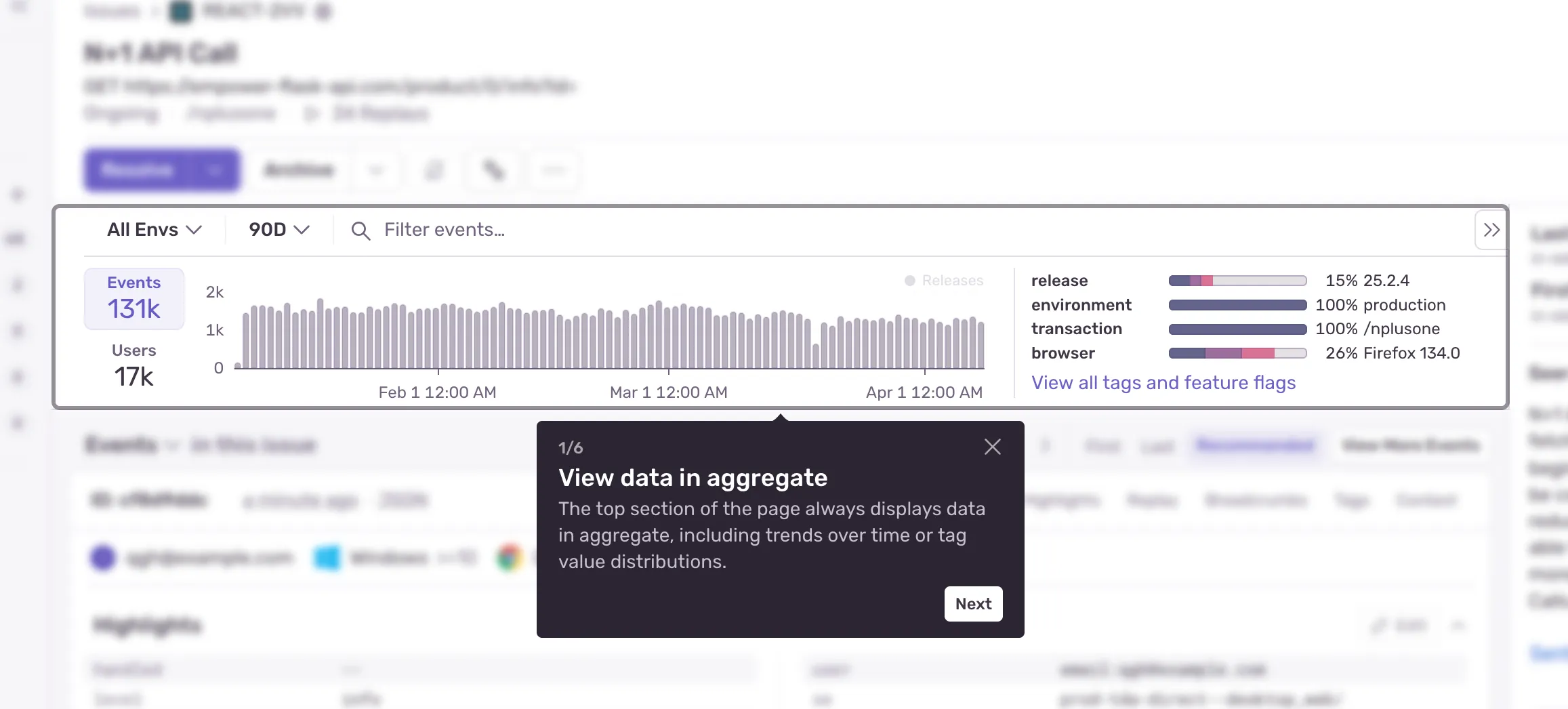
+<TourElement<IssueDetailsTour>
+	 tourContext={IssueDetailsTourContext}
+	 stepId={IssueDetailsTour.AGGREGATES}
+	 title="Check out the new graph"
+	 description="Add filters, pick a date range, and watch it change"
+>
  <AggregateGraph />
+</TourElement>
And now, we can start the tour however we want from within our provider by dispatching the appropriate action. We can have this trigger with any arbitrary conditions we want (e.g., users created after date X, organizations of subscription plan Y), and the the tour providers/elements don’t need know about it. Concerns are separated 👍
const { dispatch, isRegistered } = useContext(IssueDetailsTourContext);
return (
  <button onclick={dispatch({ type: "START_TOUR" })} disabled={!isRegistered}>
    Start
  </button>
);
So, it’s done?
Nope. I was the first ‘user’ of the new tour API for the issue details page, so I missed some of the usability pitfalls. I had put together the basics; some tests, a storybook page and doc strings where they were relevant, but an outside perspective helps quite a bit. Soon after the first tour launched, we wanted to build another for some new navigation updates, and Malachi found a few quality of life improvements:
- [#87810] Often times,
dispatch(...)calls would need to be followed by some callback (perhaps tracking analytics, making an API request, etc.) but side-effects are not permitted in a reducer function. Instead, we can allow the hook to couple the action dispatch + callback, and we could use the function without repeating ourselves all over! - [#87805] I had coupled some state for whether or not a tour was actually available to the current user that ended up complicating things. The tour itself doesn’t need to keep track of it’s availability, since that’s highly dependent on the tour. Instead, let it worry about managing the steps, and navigation, while we control access to the tour from outside these components.
Can it be better?
Probably, but at the same time, ‘better’ is a moving target. For our purposes, it works great! We’ve got some excellent feedback about it and didn’t need to overcomplicate things with a third-party library, so it’s a success. Long term, there might be a few areas we can improve upon:
- Currently, one tour = one context provider, so if we create many more tours, it might get a little messy. A helpful refactor could allow us to create a catch-all provider that manages the internal state of all tours, something like a
TourStore. We could also use this to prevent concurrent tours. - The wrapper
.cool-borderelement will always render in-place of the tour element. Depending on the tour element, this could produce some invalid DOM structure, for example nesting adivinside aul. To get around this, we can pass in a custom wrapper as a prop to use instead, or forward the styles directly to the children to get rid of the extra element.
Wrapping Up
Thanks to the many reviewers who helped shape the API, and another callout for Malachi who sanded down some of the rougher edges. The current (April 9, 2025) version of the tour provider is available to inspect on GitHub, and you may have already taken a few of these tours in Sentry already (and if you have some thoughts please let us know!). We added some nice-to-haves, like navigation via keyboard, focus scoping and new styles, but the bones still match what we’ve gone over today.
The important part, is that it’s live and being used as you read this (probably) and teaching users something new (hopefully).